Your business is already responsive to customer needs, but is your website responsive? Responsive web design is a popular term, but not everyone knows what a responsive website is. That’s a mistake you can’t afford to make for your business. Here’s everything you need to know to know what responsive web design is and to talk about it like a pro.
What is responsive web design?
The term “responsive” describes what your website should do for different devices — it should respond! That means that when someone visits your website from an iPad it “responds”, or adapts its shape and display to fit the display of an iPad. With so many devices out there you could never design for each individual device, not to mention for portrait and landscape (sideways) modes. Responsive web design is a technique that recent web technologies have made available to tackle this challenge. So, the concept itself arose out of 1) the need and 2) the technology providing a mechanism to solve the problem.
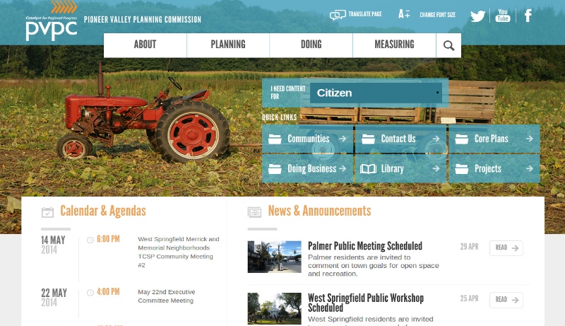
Let’s take a look at what responsive web design actually looks like. We recently completed a website project for the Pioneer Valley Planning Commission which was a full-featured website that needed to work on mobile devices as well. Above is what their website looks like on the desktop for comparison (red tractor image). You can see that it is laid out very similar to what you’ve seen with other desktop sites. There is a menu at the top with a couple of columns of content down below and a slider in the center part of the page.
Responsive Design On an iPad or tablet
The next step down in size is an iPad (or other tablet) in portrait mode. The responsive web design does a few things here. Notice how there aren’t borders on the left and right sides now. We’re more constrained on our width, so we use all of the width space for the site. We also stack images and some of the buttons so that everything fits on the page.

On a phone
Once we go to the phone resolution (in portrait), you’ll notice that the page changes significantly — not in terms of content, but in terms of design. We’ve removed the big slider image since we no longer have room for it and we can save the download time if the phone is stuck on 3G. The main menu folds out into a format that allows individual phones to handle it natively.
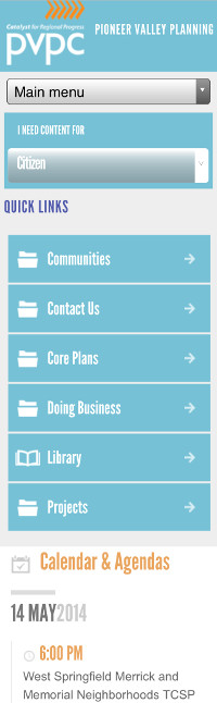
The content links are important, so they are listed vertically and allow for scrolling. Finally, you’ll notice that the content is no longer laid out in two columns, but is listed one set of data after the next. This allows visitors to scroll through the content, which is more intuitive on a mobile device anyway.
Obviously, the visual effect is the most apparent, but it’s not the only change for good responsive web design. The change for the phone is clearly a mobile-targeted change, but one thing people often forget about when designing sites for mobile is that there is no mouse cursor on a tablet or phone, so you can’t use things with mouse-over tricks, like drop-down menus. There are two primary options for dealing with that. The easiest is to use a select-based menu (like “Main menu” in the phone example).
The other option is to use a JavaScript library that understands a simulated mouse-over. The idea is pretty simple for drop-down menus. When the visitor clicks on the drop-down, the JavaScript detects if it was a quick click and turns it into a mouse-over event. In effect, when a user taps a drop-down menu, it still performs a drop-down, just like in the desktop version. This is a handy little trick to keep a similar look and feel between devices.
As you can see, there’s a lot more to good responsive design than just a “mobile version” of your website. It takes a lot of planning and forethought, but your resulting website will be the modern, user-friendly centerpiece that people talk about.
Author: Brian Geisel, CEO, Geisel Software